My Role
Product Designer - Project Scoping, Interaction Design,
Systems Design, Visual Design, Prototyping, User Testing
Team
Product Manager
Content Designer
UX Researcher (User testing)
Engineering team
Timeline & Status
16 weeks
Overview
Suppliers are small and medium businesses that rent out vehicles to drivers who do not own a commercial vehicle.
Problem Statement
While using the supplier dashboard, suppliers were struggling to find relevant information and were unable to make well-informed decisions to run their fleets effectively.
Outcome
Increase in engagement over 10x with 53% of users staying on the homepage over 10 minutes averaging 4 sessions per day.
HIGHLIGHTS
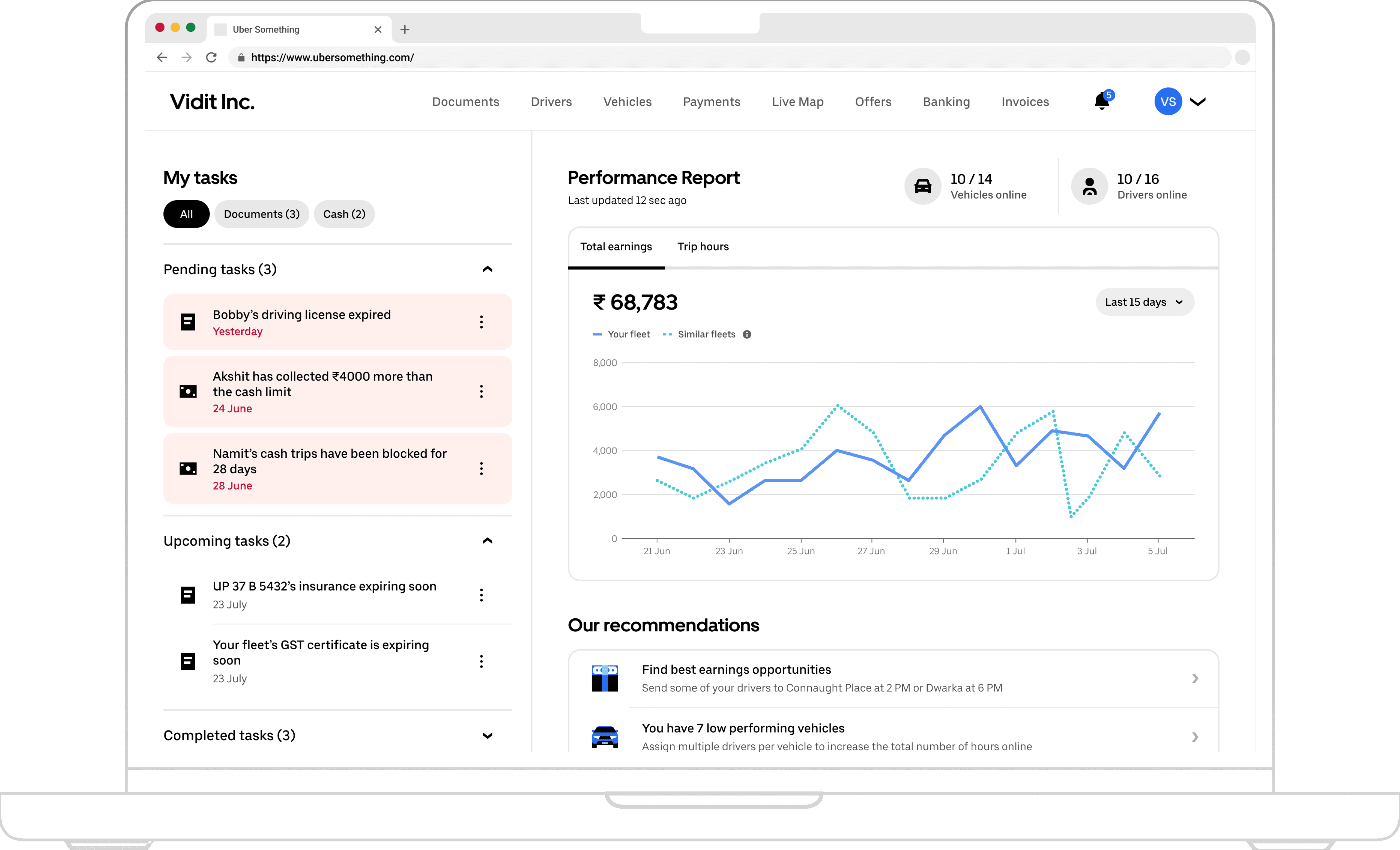
A dashboard for suppliers that provides key information, allows them to make informed decisions to manage and operate their fleets effectively.

My Tasks
Video

Performance Report
Video
Learning Center
Image
CONTEXT - USER
Backbone of Uber Marketplace
Suppliers lend vehicles to drivers
Some drivers who want to work with Uber do not own a commercial vehicle. Suppliers lend their vehicles to such drivers who drive and earn on the Uber marketplace.
Currently, supplier vehicles contribute 15% of total trip hours driven on Uber, making them one of the most important part of the marketplace.

Uber Ecosystem with different stakeholders
Diagram
Uber is facing driver supply shortage as 80% suppliers churn in first 4 months
After COVID, Uber has been struggling with limited supply of vehicles in majority of the markets.
Currently, 80% of new supplier who onboard onto the platform churn within first 4 months. Churn of suppliers was identified as one of the primary reasons behind the shortage of supply of vehicles.
CONTEXT - PRODUCT
What is broken?
Poor user experience of Supplier Portal
Currently, suppliers use supplier portal to manage and operate their fleet on a day-to-day basis. During Operations team-led surveys, supplier mentioned poor product experience as one of the primary reasons behind the churn.
A UX audit of supplier portal revealed massive gaps in the user experience of the product.
Key Findings of UX Audit
Suppliers had to switch between multiple tabs and go through multiple flows, to find relevant information which led to high cognitive load.
Supplier Portal opens directly onto the vehicle page, lacking an effective landing experience which restricts users to get glanceable information

Current Product experience
Image
PROBLEM
Finding the problem
PROBLEM STATEMENT
Our suppliers find it difficult to get relevant information that can help them make the best decisions to manage, improve, and grow their business.
So how do we improve our key metrics?
Measure homepage engagement
Increase product usage
USER RESEARCH
Understanding Users
Finding and prioritizing Jobs-to-be-Done for suppliers
Due to limited knowledge about suppliers, and a timeline too short for a full fledged UXR, I conducted targeted stakeholder interviews (Operations managers, PMs, & Lead Designer) to identify a supplier's key Jobs-to-be-Done.
With collaboration from the product manager and lead designer, they were prioritized based on severity for the fleet, current product capabilities & the supplier’s cognitive load.

Key Jobs-to-be-Done for Suppliers
Diagram
COMPETITORS
Understanding competitor dashboards
Either Incomplete or Overwhelming
Furthermore, analyzing competitor dashboards in supplier space revealed majority of dashboards either conveyed incomplete information or overwhelmed users with information & metrics.
Performance and payment metrics helps suppliers comprehend their fleet’s status
Live tracking of vehicles / trips help suppliers keep a track of their business throughout the day
Metrics heavy dashboards overwhelm suppliers and leads to high cognitive load.
Incomplete information on dashboards requires suppliers to switch between multiple tabs to find relevant information

Screenshots of competitor platforms
Image
VISION & GOAL
Defining the bull’s eye
VISION & GOAL
We aim to convey a comprehensive story that summarizes the key information for the suppliers and helps them make informed decisions.
Key design principles
Prioritizing Summary over Entire Story
We aim to deliver only the essential information and use meaningful interactions to deliver the additional content.
Delivering the right information at the right time
We want to display relevant contextual information for our suppliers to analyze their fleets and take action at that particular moment.
Driving the decision-making process
Our primary goal is to help users understand the data, analyze patterns and drive decision making with the help of holistic information.
MODULES
Every JTBD had its own place
Documents & Cash
Supplier loses money if they miss them
Documents - Suppliers forget to update their documents regularly. Due to expired documents, fleet vehicles may become out of service resulting in financial loss. This module helps them track their expired or expiring documents.
Cash - In cash-heavy markets like India & Mexico, majority of drivers owe money to their suppliers as they collect cash from the riders. Some drivers run away with this cash resulting in excess loss for the suppliers. This module helps suppliers block drivers from taking cash trips.

V1 Designs for Document & Cash module
Image
Performance
Tracking right metrics help suppliers get a perfect view of performance
Finding the right metrics was crucial to tell a comprehensive story to suppliers about their fleet. Suppliers and earners share the common goal to increase their earnings. Therefore, I reached out to earner designers and researchers to understand different metrics and gain a systems level perspective as well.
For example: If we push suppliers to drive their vehicles 24/7 with our chosen metrics in markets with low night-time demand, it could disturb the marketplace dynamics.
Eventually, mapping different metrics to Job-to-be-done and understanding their implication on the whole ecosystem helped me find the right metrics.

Whiteboarding to figure out different metrics
Photograph
Earnings is the best representation of fleet performance, dependent on earnings per hour and total trip hours
I choose three different metrics representing each Job-to-be-done that can best track performance of a fleet based on my deep investigation

For example: In the image, peak in earnings on 6th may can be attributed to increase in online hours whereas drop in earnings on 13th May is a result of low earnings per hour.

Correlation b/w Earnings, EPH & Online hours
Diagram
Crafting a short yet comprehensive fleet performance story
The goal was to convey a comprehensive story based on the relationship between different modules.
For example, In figure, a drop in total online hours on 13th May can be a attributed to unavailability of non-compliant vehicles with expired documents (shown in documents module)
Recommendations
Actionable tips to improve your metrics
After understanding fleet performance, suppliers had to find ways to improve their performance /metrics. Recommendation module gives actionable tips to suppliers based on their individual fleet performance for each metric.
Similar to the previous example, low performance in utilization can be improved by bringing inactive vehicles on the road.

Utilization & Positioning status with recommendations
Image
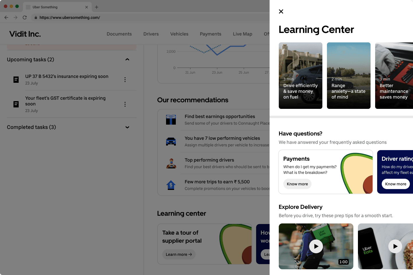
Learning center
A verified guidebook for best practices
Learning center is a verified guidebook for suppliers from Uber. It would help them grow their business and reduce customer support tickets.
In order to save engineering effort, we borrowed UI design frameworks from other Earner app surfaces.
LAYOUT
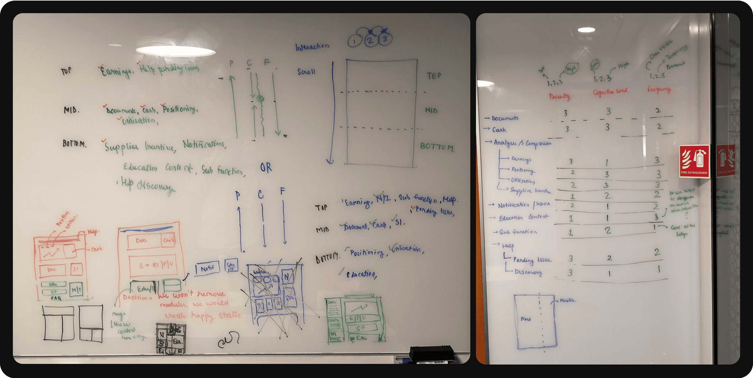
Being methodological with layouts
Arranging modules like a jigsaw puzzle
The layouts were approached methodically, determining the individual position of each module based on priority, cognitive loads for the supplier and frequency of content.
It resulted in different iterations which were further developed keeping in mind mobile breakpoints,
Whiteboarding to figure out layout/ positioning
Photograph
Two parallel columns with different purpose
Eventually, the consolidation of modules led to the following layout with a two column approach.
Left column - It is a task list, with urgent items that need immediate action. Reading left to right, the top left placed appropriate importance on the urgent tasks.
Right column - It is a combination of glanceable information to review the supplier’s fleet performance, followed by the recommendations and learning center.

Flow of Information based on importance for the fleet
Diagram
FEEDBACK
Collecting user and stakeholder feedback
In-depth stakeholder feedback
Redundant Modules
Variable modules would be empty at certain point of time. For example: If a fleet has up-to-date documentation, documents module would be redundant.
Growing number of Job-to-be-done
An ever expanding scope was expected for the dashboard as more Job-to-be-done will be added as the product grows.
Contrasting requirements for different markets
Feedback calls with Ops teams of different countries, revealed contrasting requirements for variable modules.
Two categories of module: Permanent & Variable
I regularly presented my work in Design critiques using prototypes and took feedback from senior designers along with regularly meeting product managers and operations team.
The stakeholders pointed out how some modules like Cash, Documents would be used occasionally based on the fleet management whereas other modules like Fleet Revenue, Utilization would have permanent usage.

Categorization of modules into Permanent & Variable
Diagram
CHALLENGE
So, how do we establish UI frameworks that accommodate scalable and contextual metadata?
7+ User testing sessions later..
In order to get some user feedback, we arranged moderated user testing sessions with suppliers based out of India with varying fleet sizes and lifetime journey.
Live Tracking
Suppliers want to track their live vehicles and drivers on the road to keep an eye on any wrongdoing by their drivers.
Incomplete Earnings Graph
Most suppliers were unable to comprehend peaks and drops in the earnings graph. Our suppliers were not able to understand our story.
SOLUTION
Learning from the feedback
“My Tasks”, a personalized To-Do list
"My tasks" is a UI framework that gives a personalized list of action items that require urgent attention from the suppliers. The tasks are prioritized on the basis of urgency, severity, and date of expiry.
It helps remove redundancy between modules as tasks are consolidated, gives flexibility to add more tasks with growing Job-to-be-done, and different tasks can be generated by setting rules for different geographies.

My Tasks
Image
“Performance Report”, a comprehensive summary
The testing feedback pushed us to rethink the need of graphical breakdown of Earnings per hour. Instead, we added a hover interaction on the earnings graph that displayed the entire story behind a days earnings in one view.
Also, we added a live tracking system for vehicles and drivers to help suppliers monitor their drivers on the road.
Performance Report
Video
“Our recommendations”, some tips & tricks
We encountered similar challenges of redundancy, growing Job-to-be-done and scalability while giving a permanent space for recommendations on each performance metric.
We consolidated recommendations to at a fleet level that gives suppliers top 4 things to improve at any point of time.

Our Recommendations
Diagram
IMPACT
Excited users and stakeholders...
USER STATEMENT
“I would rate it at 4.5/ 5, as it would reduce my workload by 80% and give me daily updates”

Business impact
53%
No of users staying on homepage over 10 mins
4 sessions
Avg. dashboard usage per day among fleet managers
LEADERSHIP FEEDBACK
“What a masterclass into simplifying the complex vehicle supplier ecosystem!!”
Charlie Waite, Sr. Design Director, Mobility